Visual Elements
One of the primary driving factors behind this rebrand was to significantly simplify the visual language we use to represent the Choose Energy brand. To that end, we've reduced the number of fonts, colors, and icons and also streamlined the types and usage of photography.
Colors
There are 4 primary brand colors we use throughout the site and a handful of utility colors.
Primary Colors
The brand colors are the only colors that should be used for highlight colors, buttons, text, icons, and backgrounds for blocks ($gray-lightest is the only utility color that can be used as block background).
$blue
#007fb6
$green
#009c95
$gray
#939ea1
$yellow
#fbb431
In a situation where one of the primary colors is being used to indicate a link or interactive element such as a button, the hover/active state for the element can be modified by darkening the primary color by 15% (eg. darken( $blue, 15% );).
Utility Colors
The utility colors are primarly for use as text colors or in places where contrast is needed against the primary colors.
$red
#B12704
$white
#ffffff
$gray-lightest
#f5f5f5
$gray-lighter
#eeeeee
$gray-light
#cccccc
$gray-medium-light
#777777
$gray-medium
#555555
$gray-dark
#333333
$gray-darker
#222222
$black
#000000
These colors should not be used as background colors for blocks or in any other large amount except for $gray-lightest which can be used as an alternative background color for blocks or $red which should only be used sparingly as a background color to highlight errors or other critical issues.
Fonts
We've limited the fonts in use on the site to just 2 - a serif and a san-serif.
Primary Font
Our primary font is Kievit which should be used for all body text on the site as well as any situations needing smaller type or numbers.
AaBbCcDdEeFfGgHhIiJjKkLlMmNn OoPpQqRrSsTtUuVvWwXxYyZz 1234567890 Kievit Regular
AaBbCcDdEeFfGgHhIiJjKkLlMmNn OoPpQqRrSsTtUuVvWwXxYyZz 1234567890 Kievit Regular Italic
AaBbCcDdEeFfGgHhIiJjKkLlMmNn OoPpQqRrSsTtUuVvWwXxYyZz 1234567890 Kievit Medium
AaBbCcDdEeFfGgHhIiJjKkLlMmNn OoPpQqRrSsTtUuVvWwXxYyZz 1234567890 Kievit Medium Italic
AaBbCcDdEeFfGgHhIiJjKkLlMmNn OoPpQqRrSsTtUuVvWwXxYyZz 1234567890 Kievit Bold
AaBbCcDdEeFfGgHhIiJjKkLlMmNn OoPpQqRrSsTtUuVvWwXxYyZz 1234567890 Kievit Bold Italic
Secondary Font
The secondary font is Bitter which should be used for headlines or text that should be called out or highlighted.
AaBbCcDdEeFfGgHhIiJjKkLlMmNn OoPpQqRrSsTtUuVvWwXxYyZz 1234567890 Bitter
AaBbCcDdEeFfGgHhIiJjKkLlMmNn OoPpQqRrSsTtUuVvWwXxYyZz 1234567890 Bitter Italic
AaBbCcDdEeFfGgHhIiJjKkLlMmNn OoPpQqRrSsTtUuVvWwXxYyZz 1234567890 Bitter Bold
Bitter should never be used for body content text or any area which is conveying a lot of dense information as it is not as readable in large blocks as the primary font.
Icons
We use 2 different icon fonts for the various icons across the site, one is custom and the other open source.
Choose Icon Font
Our custom icon font is called ChooseIcon. This icon font is created and maintained using IcoMoon from a set of individual SVG files that can be found in the Creative Assets folder on GDrive.
In addition to being used as iconography alongside descriptive text, these icons can be used as graphical elements on the site, either within block or on their own.
The font currently consists of 12 line-based icons built on a 20x20 grid - all lines have a weight of 1 and do not narrow, converge, or have rounded ends. New additions to the ChooseIcon font are allowed, but should be done sparingly as we want to maintain the simplicity of our iconography. As a font, any of the icons can be displayed in any of the brand colors but should not be filled, skewed, fliped, or rendered with a gradient.
FontAwesome
For other utility iconography, we default to using FontAwesome instead of building and maintaining our own custom set of utility icons. FontAwesome icons should be used for situations such as actions, arrows, shopping details, loading indicators, and social media brand icons. FontAwesome icons should never be used as graphical elements anywhere on the site and should also be used at smaller sizes if possible to avoid taking precedence over our own icons.
To maintain our brand style, we prefer to use outline versions of Fontawesome icons wherever possible.
Photography
We use photography sparingly across the site, balancing it with blocks of color in our primary brand colors and ChooseIcons as graphical elements.
One of the key rules to using photography for our brand is that text should never be overlayed on top of photography. If text is needed to support the message, it should be included in a solid colored block near the image as white text over one of the brand colors. This way we can ensure any text used will always be legible and that the we maintain the simplicity of our brand style.
Hero Photography
Hero photography should be the only situations where we use people as the focus of the image. Our ideal hero photo has the following characteristics:
- Simple, life-like composition
- The subject(s) not looking directly at the camera
- A realistic environment (ideally of or near the home)
- A muted color palette with a pop of color or two complementing our brand colors
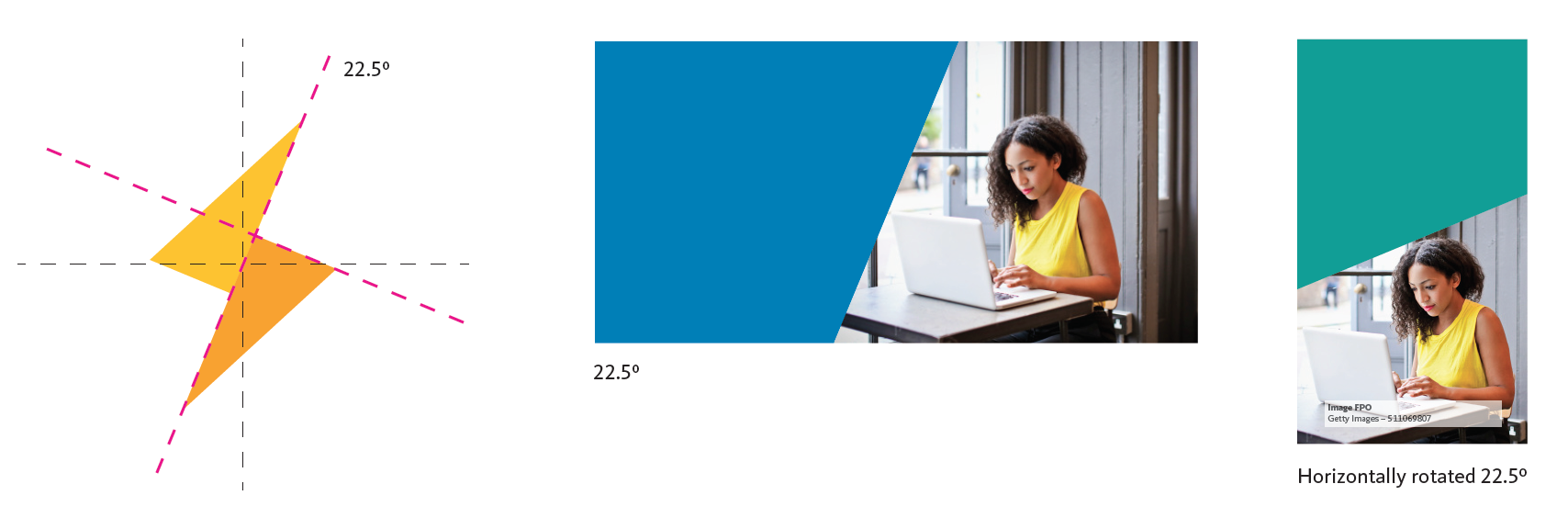
A hero image is always paired with a color block with an angle matching the angle of the bolt in our logo. Care should be used in choosing a hero image that will work well when cropped at an angle.

Other Photography
We can also use photography as the background to blocks to balance out blocks of color and provide visual interest. In these cases, we should avoid using images where people are the foucs and instead lean towards imagery that directly references energy such as lightbulbs, energy meters, natural gas flames, cables or switches, and houses with lights on. Our ideal support photo has the following characteristics:
- Strong, graphical composition
- A direct reference to energy in use
- A muted color palette with a pop of color or two complementing our brand colors